–
Are you tired of constantly worrying about the things that may go wrong when you’re sending files to your local printer? According to a print production expert, 25-75% of the design budget should be allotted for the printing cost. The reason for this is that it is much more costly to fix the design in the final stage, so in order to avoid it. Opt for using a prepress before printing down your final design. (lead-in)
What is a prepress and how does it work on our product packaging?
Pre-Press is a printing industry term that prepares the graphic design for your product packaging without any actual printing happening.
Also prepress is in charge of making sure that your printed design comes out without any issues such as color deformation or size-related problems.
Preparing graphic design for your product packaging is relatively quick and easy as long as you are using the right elements with the prepress.To give you an additional insight on what to consider when using prepress I’ve made a list of what you need to look for in finalizing your packaging design. It incorporates everything from the design stage up to the technical procedures needed to finalize your designs.
Listed below are things to know when using prepress:
1. Proofread everything
Proofreading serves as clients’ verification for printing accuracy which is a cost-effective way of providing visual copy without actually creating press proof. The main objective of proofing is to produce either a soft or hard copy of what the final product will look like on the press. Catching errors in your packaging design is very important when you’re printing.
Simple oversights like grammatical errors can be a huge deal breaker for a customer in choosing what to buy. Prepress proofreading edits to the visual appeal of the graphic design. Be consistent with the line lengths to maintain uniformity. Longer or shorter lines can throw off the general uniformity in a block of text if it’s not spaced properly.
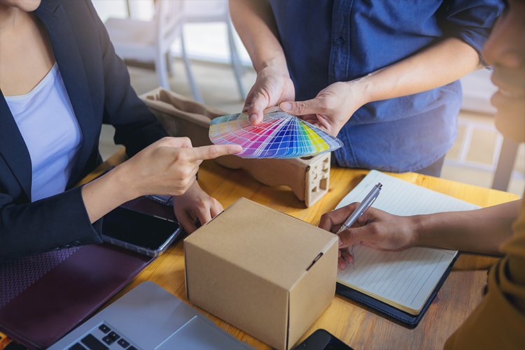
2. Choose the right color
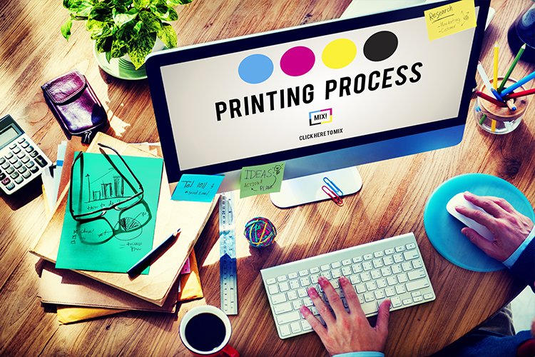
Using the right color for your flexible packaging is very important to make your packaging stand out. There are commonly two types of color models used in prepress: RGB (red, green, blue) and CMYK (cyan, magenta, yellow, and black (key). The colors that you see on the screen where your digital file might be can differ from the actual printing. To ensure that your colors match you can check the existing color mode of your design.
Another thing that you should keep in mind is that most software programs use the RGB color mode by default. Using the CMYK process to overlay the different tones of each color can be an additive process in creating colors with a much deeper impact on your packaging.

3. Calibrate your screens
To have more color accuracy we need to calibrate the screen before printing. I personally know some manufacturers who have trouble in getting their true tone colors when printing their mock-up drafts because of inaccurate color accuracy in their screen. Designers should check their color accuracy and images before sending it off to the printing press. By doing so we can make sure that the imagery is correct before it is printed saving you money for misprints if ever you may have one.

4. High image quality
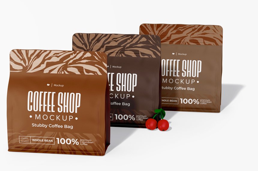
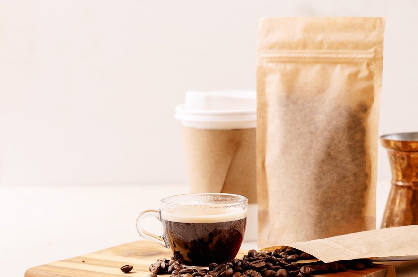
Good packaging should possess a high and clear image quality that can appeal to your consumers. But how can we provide images with high resolution? Using a vector or pixel-based image with a 300 DPI or higher ensures us a clear resolution. Another tip to remember is not to enlarge photos more than 20 percent from their original size. Because the resizing images can alter the resolution of your graphics which may affect your packaging.
5. Packaging dimension
Your packaging dimension should be in line with your packaging designs. In printing your packaging designs you should always check your file’s bleed, crop, and cuts to make sure it is lined up accordingly. The reason for this is that it indicates the edges of your design and where cuts should be made once things are printed. These will give your packaging a professional and finished look that will make consumers want to buy your products.
Crop marks show where your design will be cut, and the bleed indicates where text or objects extend over the page limit to compensate for trimming. The slug is an area considerably outside the bleed featuring printer instructions, additional information about the print, and other important job information. Ignoring the bleed risked resulting in a white border along one side, where the film can extend beyond your digital design.
If your text or images buttress the crop edge or a fold, you must additionally consider the cutting tolerance of your selected paper. Subtle differences in your layout can make a big difference when it comes to symmetry once your packaging design is finished and printed.
6. Make sure that the Fonts are readable
Every design incorporates some form of text like the product’s nutritional benefits, this is why its important to know that the fonts used in the packaging is readable. Often times the way that text is displayed or the amount of text on the package can contribute to a package that is difficult to read and not pleasing for the consumer to look at.
Also if your fonts are not included in the file then it is important to know that all text must be converted to outlines. This is to ensure that no changes or losses will be made in the artwork’s original appearance.
7.barcode
The (FDA) Food and drug administration proposed a regulation that every product needs a barcode. So it’s important to make sure that it is clear and correctly formatted. Ensure you submit a high-resolution barcode image that is in a vector file format. Your barcode also should be 100% black, not navy or other dark colors.
8. Hard copy proofs
Investing in hard copies is ideal to make sure that your packaging is perfect or if there is any alterations needed. Also, your clients may also love this since they can see their actual packaging and make changes accordingly if needed.
9. Know your printer’s limits
Our final pre-print check is to consult with your printer.
Check with your printer to see if its compatible with the designs you have and the requirements you need. Understand the limits of your printer and equipment before settling on a decision. By doing so you are avoiding unnecessary risk or damages that may happen to eh packaging once it undergoes printing. Saving you money from going over and doing it again if all these elements are taken care of I guarantee that your packaging is worth the wait.

For rotrogravure printing
PANTONE colors will automatically be converted to solid coated colors as well as any spot colors if it is included. White or matte colors are treated as separate and must be categorized as both spot colors. Indicate any clear knockout (window areas) to avoid any misunderstanding. 9 color maximum. Tint ranges: 30-80%. Minimum line thickness: 0.5 pt. Adjustments to the original artwork may be necessary to meet standard production guidelines (ie. similar colors, white text outline, etc).
For Screen Printing
Artwork should be designed to allow for a 1 pt trap for overprints. Minimum line thickness – Text: 4 pt, Lines: 0.75 pt. The reverse type may be stroked to compensate for fill-in during printing. 8 color maximum (including the varnish). Tint ranges: 20-80%. Maximum line: 155 lines. Plate movement tolerance: ą 1/16 inch. Note that artworks can be adjusted in order to meet the standard guidelines needed for your packaging
Sending Artwork
Uploading artwork files and designs should be under 12 megs. Artwork files can be sent to Alex@xy-pack.cn.
Conclusion
The role of prepress in packaging has drastically changed over the years. Using prepress whether it be for product packaging or just flyers has become a game changer for many print service providers. Since it delivers the highest level of satisfaction for many consumers while maintaining its high quality and profitability it is a win-win for both sides. This only shows how great innovations is when it comes to technology.
Here at xiaoyupack we ensure that all your designs and digital files are greatly taken care of and can be printer ready once the file is submitted. You’ll only be waiting for a couple of days before your product is ready to be displayed on the self. We are ecstatic to be with you every step of the way, feel free to message us or give us a call if you still have any questions.